Wednesday, December 28, 2011

Arts and Craps

Photo 13: Advanced Digital Darkroom.  Or as one of my fellow students disaffectionately called it, "Arts and Craps."  As much as I agreed with the sentiment at the time (and pretty much still do), looking back, it wasn't so bad.  As the cliche' goes "hindsight is 20/20".  And reflecting on it now, I have to admit.  I took away some things of value.  Nothing concretely useful, really.  But in terms of perspective.  During the course of the semester, I was exposed to certain artists and ways of thinking about photography that I wasn't very aware of before. Consequently, I made some things that I probably wouldn't of made otherwise.  That's not to say that I've changed my mind.  It was a pretty useless class.  But I guess sometimes even useless things can be inspiring. :)


Such a Square


Summer afternoon in December


Uelsmann Moon

You can see more Here if you'd like.

Thanks for reading.

Thursday, December 15, 2011

Corporate Graphics?...

So for the past couple months, I've been trying my hand at corporate graphics. And the results have been mixed.  Clear, concise messaging? Clean leading lines? Complementing colors? Negative space?  These things don't come as easily to me as maybe they should.  And there are many times that I wonder why anyone would pay me to do this.  But, seeing as I haven't been fired yet, I suppose I'm doing something right. ;-)

10" x 10" Square Card

In-company email blast

In-company email blast

8.5" x 11" flyer

8.5" x 11" flyer

Thanks for reading!

Monday, November 14, 2011

That thing I did last month...

Thanks to Cesar and Stephanie for a fun shoot and Congratulations on their engagement!


Click HERE to see more.

Thanks for reading!

Tuesday, October 11, 2011

Come on, come on, come on, come on! PHOTO RETOUCH me, baby!

Some people don't like retouched photos.  They have a photo-journalist-esque heart, and want brutally honest pictures ... fantasy and idealism be damned!   I'm not one of those people :-).  I love photoshop and retouching.  I want things to look as good as possible…  accuracy be damned!  I zap zits, paint uneven skin tones, add extra limbs … if the picture would be better served with a mystical rainbow-maned unicorn prancing along in the background, I'm all for it.

Mystic Unicorn FTW!!!

It doesn't help that more times than I'd like to admit, I'm fixing a mistake I made while shooting, but that's besides the point. :-D

There are many pitfalls with retouching, however.  Because it's really easy to overdo it.  And overdoing it does not look pretty.  A picture can turn into a cartoon real quick if you're not careful. 

Keep that doll away from the knives!

The trick is subtlety.  Early on, I fell into the overdoing it trap (I might still be in that trap) but the more you do it the better you get (at least that's how the theory goes) and so I'd like to think that I did a believable job on this happy couple I helped shoot the other day.

From drab to FAB!

After adjusting exposure, white balance and contrast, I cleaned up certain areas of the lovely Cindy's face, including evening her skin tone, zapping blemishes, and cleaning up a few dark spots under the eyes.  I also increased the color saturation on parts of their faces (like the lips). 

With this one the main adjustment was for exposure, since he was in shadow.


In the end, my goal in photo retouching is to make photos look better without it looking like I made the photos look better (if that makes any sense).  In other words, adjust the photos with enough subtlety that no one knows that I've made adjustments in the first place.  Hopefully I've done that with these photos, and double hopefully I get better at it in the future.

Thanks to Mike for letting me tag along with his shoot, and thanks to everyone else for reading.  Feel free to tell me what you think in the comments below.

Friday, September 23, 2011

Sometimes I forget how pretty this place can be...

I know more times than not, I'm complaining about being here.  But every once in a while, amongst the seemingly endless sea of dirt and brown, I'm reminded of just how pretty this place can be.


I'm just sorry it was gone before I could find a better vantage point...

Wednesday, September 7, 2011

Variety is spicey... or something like that...

A little while back, I was looking at my portfolio, and thought it could use a bit more variety.  Because you know what they say, "Variety is spicey " ... or something like that ;-) ... So, I took a little time to create some new more commercial-ish type work.  Here's some of the things I put together.


Riverside Arts Walk Promotional Promotional Postcard
8.5" x 5.5"
Front: Top
Back: Bottom
(Artwork by Christina Pulido)

XO Lounge Promotional Flier
6" x 10"

Tri-Fold Brochure
8.5" x 11"
(Outside)


(Inside)


Hopefully these pieces are a bit more professional than what I had before… (cause frankly, outside of the realm of "make the homes laugh" some of my work is pretty juvenile/inappropriate :-D).  

As always, you can see more Here

 and ...

If you like what you read, like me on Facebook, or comment below.

Monday, August 15, 2011

No one can earn a million dollars honestly...

So last week, i got tagged on Facebook to play the Photoshop Game.  For those of you who don't know the rules (which probably isn't many since I re-tagged pretty much everyone to play) are as follows:

 1 - Go to "wikipedia." Hit “random... Read More”
or click http://en.wikipedia.org/wiki/Special:Random
The first random wikipedia article you get is the name of your band.

2 - Go to "Random quotations"
or click http://www.quotationspage.com/random.php3
The last four or five words of the very last quote of the page is the title of your first album.

3 - Go to flickr and click on “explore the last seven days”
or click http://www.flickr.com/explore/interesting/7days
Third picture, no matter what it is, will be your album cover.

4 - Use photoshop or similar to put it all together.

5 - Post your cover with your name/album title links


Here's what I started with,

Band Name: Shocker Toys 
Quote: "No one can earn a million dollars honestly" William Jennings Bryan 
Flicker Photo:

It's some guy playing the harmonica (or so the titled of the picture stated)

And here's what I came up with.


I basically played with an overlay of a couple Photoshop filters to get the drawn/painted effect, and then dodged the eye to make it a more prominent focal point. 

I used a radial gradient overlay for the colors, borrowing swatches from a picture of a $100.

The band logo, I took from an image off deviant art, desaturated it and livetraced it in Illustrator.  Added Text then faded the opacity it in Photoshop.  I created a block of text then used a blending mode to create a little more texture in the background.

Then I grabbed a CD guide template off google and laid it all out.

Fun times! :-D 

Thanks for reading and if anyone else wants to play or has played, I'd love to see what you come up with.  You can link me in the comments below.

Monday, August 8, 2011

Bad Dog! Bad!...

Animal photography is tough.  I have two very lazy, sedate dogs, and even getting good shot of them can be a big hassle.  One of them is so lackadaisical I'm not even sure if she's conscious half the time.  She just sleeps for hours on end then gets up and stumbles around only to find another spot to sleep in again.  The other moves the second a person enters the room. So any potential shot of her is obliterated by dog in the face. 

But every once in a while they do something or position themselves in a way that makes a decent shot possible. Like these morning shots I was able to get over the weekend.  (And yes, I realize that all the shots I ever take are of them sleeping, but that's pretty much all they do.)

I must admit, there's a bit of Photoshop magic going on in these.
Lets just say the brilliant morning sunrise coming
through the window was more seeping than bursting.

Again, you can see more shots like these on my flickr: HERE

Thanks again for reading!  Comment below if you like!

Monday, August 1, 2011

Oldies But Goodies!!!

Hello All!  It's that time again.  The first of the month, when all our files get backed up onto the external HD.  Let's all give a heartfelt sarcastic YAY! :-) ... But anyways, while cleaning out my computer, I stumbled over a shoot that I helped out on last year for a now defunct MMA sports wear company.  The shoot was fun, and the girls were cute :-),  so I thought I'd share some with you.


You can see more on my Flickr HERE

Thanks for reading, and feel free to comment below.

Monday, July 18, 2011

That thing I did last month...

Here are some photos of a wedding I helped shoot last month.  Much thanks to Kyle and Mayra for having us on their special day :-).


You can see more of the set HERE

Thanks for reading! Comment below.

Monday, July 4, 2011

I'm Blind! part 2: So I kind of like Flash now

Don't get me wrong.  I'm still a warm  orange sunset guy.  But using flash (particularly off camera flash) can really save your shots when you don't have the greatest lighting conditions outside. 

For example, yesterday I was hired to shoot a very large family reunion.  They wanted essentially portraits of each individual family plus one giant group shot of all of them (there was easily 90 plus people there).  My window to shoot was about 3 hours (from 10:30 - 1:30) and if you were outside in Riverside, you know how bright and awful the sun was.  On top of that it was a disgustingly hot 105-ish degrees. 

But anyways, under regular circumstances, those lighting conditions will not do.  The light is way too harsh and the straight down noon light just flattens everything.  Not only that but everyone is inclined to squint and not want to take off their sunglasses.

-_-  <--- squinty face emoticon!    

Your only real option is to shoot in the shade.  But there's a big dilemma here.  If you expose for the background, the shadows become super black holes of nothingness... but if you expose for the shadows, everything outside the shadow becomes bright white nuclear winter.   

For example, here's the area I chose to shoot. 

Top is exposed for background and the bottom for the shadows


Now in comes flash.  By using my two flashes, I was able to put my subjects in the shaded area (eliminating the squinties -_-) without blowing out the background, AND simulate some decent side lighting.  Thereby saving my shots and the day!!!

YAY FLASH!!! HIGH 5!!!

Example of Triumph 1
 
Example of Triumph 2

Example of Triumph3

I still almost died of heat stroke, but at least my shots came out pretty decent.  ;-)

Moral of the Story: Flash is Pretty Sweet!

Thanks for reading!  If anyone has any comments, questions or critiques, feel free to say so below.

P.S. Happy Fourth!!! :-D

Monday, June 20, 2011

I'm Blind! : My Follies with Flash Photography

I'm one of those photo guys who thinks that nothing beats the rich glow of a summer sunset.  If I had it my way, I'd probably shoot in nothing but that kind of light.  The problems with that are pretty obvious. Firstly, sunset light only lasts about a couple hours a day.  The whole thing about the sun only being outdoors all the time doesn't help matters either :-).  

So in comes flash.  I don't use it very much.  I should probably practice with it more. And my lack of experience with it is probably glaringly apparent in my photos :-D. (See what I did there? Flash. Glaring.........  If you were cool, you would of laughed at that :-P)    You can probably tell in these photos that I took for my recently concluded photo journalism class, too.

The assignment was for an environmental portrait using flash. 

My subject: cousin, Teso, who is an ex-death metal guitarist.  (Thanks again, homie!).

So back to flash, after you get a decent exposure, you really have to look out.  It's easy to adjust for blown out foreheads and eyeballs and large harsh shadows.  But you have to be careful.  Because sometimes it's easy to miss little things. Like over-exposed reflections off objects away from the subject or small-uber harsh shadows, like the one on Teso's face from his hair.

On top of that, it can be hard to notice those things off the tiny LCD monitor on the back of your camera.  

Don't get me wrong.  I don't hate flash, and I'll probably like it more practice I get with it.  It's uber-cool when it comes to adding motion blurs, por ejemplo.

THE ROOF! THE ROOF! THE ROOF IS ON FIRE!!!!!

But, to conclude.

Moral of the story:  Nikon needs to invent an affordable and portable minnie sunset sun for photographers.

Thanks for those who read this thing (Hi Mom!) and feel free to leave any comments, questions or critiques below.

Monday, June 13, 2011

A Passion for Dance...

Thanks again to Ms. Habibi for letting me shoot her and her class.


Performance in Hemet


The Full Set can be seen on my flickr: HERE

Thanks for reading!

Wednesday, June 8, 2011

Jpeg vs Raw: An Epic Battle to Determine the Fate of the Universe!!!!!

When i first started shooting in Raw a little while ago, it was a major revelation.  There is so much more you can manipulate with raw, versus jpeg.  All the Photoshop sliders and micro adjustments at your disposal.  You can make a photo look completely different from the way that it was originally shot.  You can turn bursting early morning yellows into the warm embrace of late afternoon reds and oranges.

With Raw nothing is beyond my grasp! Reality is mine to bend and control!  With Raw at my disposal I shall control the continent!

NAY! THE WORLD!!!

Meglomaniacal Laughter!

 Or so I thought...

The thing about Raw, though, is that with all that power comes a butt-load of work.  There is a lot to process with Raw.  Like oodles.  Sure, you can just choose all of your images and make the same adjustments at the same time, but, boy howdy, a lot of them don't look good with the same adjustments.  So you'll have to go over and tweak them anyways.  And that's all well in good in some cases.  Like when I'm taking portraits, or stuff that I may later use for graphic work, I want that kind of control.  

But what my feeble mind is slowly starting to grasp is, when I'm photographing an event (thousands of photos are taken as oppose to hundreds) and you won't be needing to manipulate your photos all that much, Raw becomes more of a hassle than it's worth.

Case in point.  For my final project for my Photo Journalism class, I shot a wonderful class of belly dancers.  I was shooting in Raw to begin with, but halfway through the class, I found out that I didn't bring enough memory cards.  So I ended up switching to jpeg to save space. 
 
Roughly half of these images were shot in Raw and the other half in Jpeg. 

When I began photo-editing, with half my shots in raw and jpeg, I really saw no difference after the minimalist editing that needed to be done.  With the black and white and "don't touch it" style that is photo journalism, you really don't need to manipulate things all that much.  In the end, Raw was just a hassle and took up way more memory space than it was worth.

So… Moral of the Story:

When shooting events that you don't intend to go all photoshop crazy on, I recommend shooting in jpeg.

If you want to go all artsy fartsy, however, go with Raw.

Shout Outs to Ms. Hadia Habibi and her class!
You can visit her website HERE

Thanks for reading!  If anyone has any comments, questions or critiques, feel free to say so below.  :-)

Tuesday, May 31, 2011

Photos from PIASC

Here are some photos of the Riverside Entrants and I from the PIASC dinner a couple weeks ago.  They're not mine (I was too deep in food coma to take anything good), I think they give a good overall impression of the night.

See the whole album HERE 


Thanks for reading! :-)

Monday, May 23, 2011

What You Say Matters…

A lot of times when I have to design a poster or graphic or something, I tend to get too caught up in the visuals and not so much on the message.  Especially early on in my visual education, I'd mostly look to create something that looked good, and then try to find or make up text that would fit it.  And to tell the truth, that worked some of the time.  I'd just stumble onto an appropriate look, and then find words that seemed to work.  But, that is/was no way to be consistent.  And if you're talking about being a designer, and having some sense of control over your work, "hit and miss" strategies like that definitely wouldn't be the way to go.

And that's where research comes in.  It's important when you're starting something, to not just stumble over your thousands of bookmarked Photoshop tutorials, find the coolest looking effect, and design around it.  Think about what you're going to say and why you're going to say it, then start trying to think of ways to visually communicate that idea. 

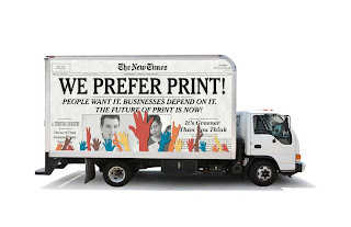
And sometimes, what you say can be more important than what you see.  Which I think was the case with the PAiSC Truck Graphic competition that I entered last month.  The project was to design a truck "wrap" to market printing as a viable, green industry.

Here's what I came up with.


After looking over what the other applicants submitted, there were a lot of pretty good looking ones, and some that I think were much better looking than my submission.  But the thing that I think set mine apart was the thought I put into what I wanted to say. A lot of the applicants, although visually appealing, didn't have a strong message, or in one case didn't even come up with an original message, just taking the headline off the PIASC website.

You can judge the other submissions for yourself on the PIASC website: HERE

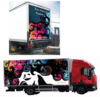
My personal favorite was one submitted by Natasha Granell, a student from Fullerton College.

It's way better looking than mine, but I think the text get's lost in the graphic, and it's probably a little too abstract/artsy for this very commercial competition.

Thanks for reading!  And if anyone has any comments, questions or critiques, feel free to say so below.  :-)