Tuesday, May 31, 2011

Photos from PIASC

Here are some photos of the Riverside Entrants and I from the PIASC dinner a couple weeks ago.  They're not mine (I was too deep in food coma to take anything good), I think they give a good overall impression of the night.

See the whole album HERE 


Thanks for reading! :-)

Monday, May 23, 2011

What You Say Matters…

A lot of times when I have to design a poster or graphic or something, I tend to get too caught up in the visuals and not so much on the message.  Especially early on in my visual education, I'd mostly look to create something that looked good, and then try to find or make up text that would fit it.  And to tell the truth, that worked some of the time.  I'd just stumble onto an appropriate look, and then find words that seemed to work.  But, that is/was no way to be consistent.  And if you're talking about being a designer, and having some sense of control over your work, "hit and miss" strategies like that definitely wouldn't be the way to go.

And that's where research comes in.  It's important when you're starting something, to not just stumble over your thousands of bookmarked Photoshop tutorials, find the coolest looking effect, and design around it.  Think about what you're going to say and why you're going to say it, then start trying to think of ways to visually communicate that idea. 

And sometimes, what you say can be more important than what you see.  Which I think was the case with the PAiSC Truck Graphic competition that I entered last month.  The project was to design a truck "wrap" to market printing as a viable, green industry.

Here's what I came up with.
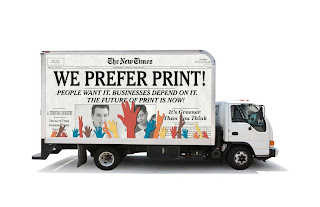

After looking over what the other applicants submitted, there were a lot of pretty good looking ones, and some that I think were much better looking than my submission.  But the thing that I think set mine apart was the thought I put into what I wanted to say. A lot of the applicants, although visually appealing, didn't have a strong message, or in one case didn't even come up with an original message, just taking the headline off the PIASC website.

You can judge the other submissions for yourself on the PIASC website: HERE

My personal favorite was one submitted by Natasha Granell, a student from Fullerton College.
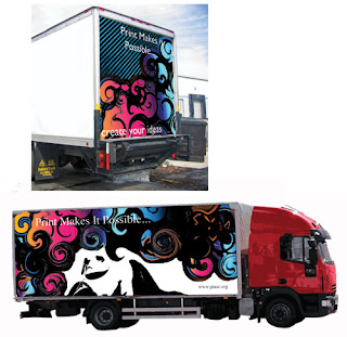
It's way better looking than mine, but I think the text get's lost in the graphic, and it's probably a little too abstract/artsy for this very commercial competition.

Thanks for reading!  And if anyone has any comments, questions or critiques, feel free to say so below.  :-)

Monday, May 16, 2011

Weekend Photoshop Fun

Just a little fun with a not so great photo I took the other week.

original

 Hopefully the end result doesn't look too fake :-).

I've dubbed it, "The Night of Decievery!"
Any comments, suggestions or critiques?  Feel free to leave them below ;-).

Monday, May 9, 2011

I'm not Stealing! I'm paying homage!

Don't steal!  Stealing within design or elsewhere is wrong…. However… it's perfectly ok to pay homage to someone else's work.  So don't steal.  Just pay homage to a design you like within your own ;-). 

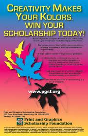
But, all kidding aside, sometimes when you don't have any concrete ideas of where to to take a design, mimicking someone else's can get you started.  And getting started is always the hardest part.  Not only that, but once you get started and have things on screen to work with, you can mix and match the different elements that you've "homaged"  in order to make the design your own.  And this was the case with the Print and Graphics Scholarship Foundation poster I created for their design competition.

At first I wasn't sure what direction I wanted to take my design.  So after a quick Google search, I looked at a couple of posters of previous applicants.  Including. last years winner. 


The previous year's winner. It's a bit too intense for me.  Really bright colors are splashed everywhere and the layout is a bit all over the place.


I like the simple color scheme and layout of this poster.

So after deciding to "pay homage" to the design above, I looked back at some of my previous work and found something I made earlier that I could also "homage" from.

Something I made when trying to create a logo.

After I had these elements and ideas on screen, it didn't take too much time to put them together into something new.

My Final Design.  PGSF Scholarship Poster

Thanks for reading! If you'd like to see more of my graphic work or photography be sure to check out my Flickr and Facebook.  And if you have any comments, suggestions or critiques feel free to leave them below ;-).

Monday, May 2, 2011

Pole Poetry (A Pole Dancer's Picture Book)

So, recently I was reminded of something I made a few months  ago that never saw the light of day.  A very close friend of mine commissioned me to make a picture book as a gift for her then fiance'.  The book was pictures of her pole dancing.  Now before you guys start making assumptions, NO, she is not a stripper :-P.  She is in fact a married and very successful professional (earning her masters degree from a reputable cal state).  She only pole dances for fun and exercise (with her clothes on) and does so only with other well-to-do peoples :-D.

Anyways, I took the pictures and made the layout, but it turns out that the print book place that she chose only accepted templated layouts.  And since we were out of time, we had to throw together something using their design schemes. 

After rediscovering it now, though, I still kind of like it.  So, after getting consent from the very graceful model, I decided to share with y'all. ;-) 

Cover: 8" x 8" Hardcover Book
page 2 & 3
Text: "I am a dancer.
I twirl, leap, and spin.
I jump, pirouette, and tap.
I am a dancer."

The text on the first page, and throughout the rest of the book is from a poem I found.  I'd like to give credit to the poet, but no one seems to know who wrote it.

The whole book layout can be seen on my flickr: HERE
(Sorry for the obnoxious watermarks.)


Don't forget to comment below peoples!